In today's post, I will want to show the final work on my website.
I'll start with the home page. I don't really like the video because it contrasts too much with the background. However, since I don't have a better idea to fill this space, I'll leave it and look for something more suitable on the weekend when I have more time.
After consulting with my tutor, I decided to change the background to a photo I took in the "Tatra" Mountains. I also removed the video and replaced it with a quote from Francis Ford Coppola.
I will leave the About Me page as it is. In my opinion, it looks good enough not to change anything.
On the contact page, I changed the appearance of the button. I adapted it stylistically to this subpage. First, I changed the shape to an oval and changed the background to a translucent dark one. Later I changed the font size and color to make it more visible.
The portfolio page looks good to me, so I decided not to change anything. It also looks good in the mobile view. Maybe if I notice any mistakes later, I will have to correct them.
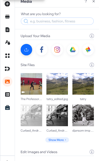
Finally, I checked the subpage where I will upload my project. I had to change the background on it. I did this by going to the Site Design tab. I uploaded a photo I found on the internet and used it as a background.
Later I changed the font color in the description to make it more contrasting with the background. This is what this page looks like after the changes.
Because the subtitles blended too much with the background, I brightened the background and changed the font color to black. I also added my project.
Planning stage:
What were your initial ideas for creating a website? style / name / template
I wanted to make my website simple. I know from my own experience that overly complex websites are unreadable and often have technical problems. At the same time, I wanted it to be diverse, so each subpage has a different style. I used my own name because I think it is important for artists to be identified with their works.
Do you have a tagline on your website?
No, I do not have.
Research:
Which designers / artists (relevant to your continuation route) websites did you look for inspiration?
I looked at screenrant and Chris Rogers for inspiration. The screenrant site was refined down to the smallest detail and I would like to carry over the same quality, and Chris Rogers' site showed interesting content. I got some useful things out of both.
How many pages did you want to make on your website and why? Did that change as you progressed onto the research / designing stage?
On my website I would like to have a home page, contact page, about page, and a portfolio with links to my work. Later, I added a feedback page to check reception and find out what I could improve.
Content:
What is the purpose of your website?
I had to create this website as an assignment for Digital Arts. Its main goal is to show my works.
Who are your potential website users?
My potential recipients are people looking for home-made films. Probably more men than women, because my works will be more likely to be related to topics typical of stereotypical men, such as sports, motoring or third world countries.
Why do you think it is important to have a digital portfolio website?
For creators, a portfolio is a showcase. Thanks to the ability to upload their works to the website, the creator can communicate with people from all over the country or even the world. This gives you easy access to potential customers.
Design:
Which design elements / tools did you use? (e.g.: infographics, fixed header, static background image, navigation menu design, text boxes, image galleries, social media feed) and why?
I set a static background on all pages. Each has a different photo as a background. I added social media and coppyright icons in the footer. For now, only blogger and facebook. On the Portfolio page and the subpage with my project, I added linking buttons between the two pages. I added text fields to the Home Page and About Page. On the Professor subpage, I added a wix video in which I posted my work. On the Contact page, I added a contact form with a link to my email so that users can easily contact me. I added a Google form to the Feedback website so that I could conduct a survey and find out people's opinions.
How many pages does your website have and why?
My website has five pages. I included Homepage, About, Contact, Portfolio and Feedback. In my opinion, this is the right number of pages to include everything needed.
Navigation:
Does your website have working social media icon links?
Yes. There were slight problems with that but I fixed it.
Are your pages connected / interlinked?
Yes. The Portfolio page is connected to The Professor subpage using buttons. So you can easily navigate between them.
Is it easy to navigate?
According to the opinions I have collected, navigating my website is easy.
Does the “Contact” page / email link work?
Yes. I checked it and it works fine.